Overview of response rates
At the top of a feedback process’s status page you see the response rates for the selected edition as charts. Depending on how many perspectives the process has, one of two views is used.
For participation and response rates in a new dashboard, see Analyze the whole feedback round.
One or two perspectives: donut charts
Feedback processes with one or two perspectives are shown as donut charts. Each chart tracks the progress of a single perspective, and the percentage in the center is the share of finalized participations.
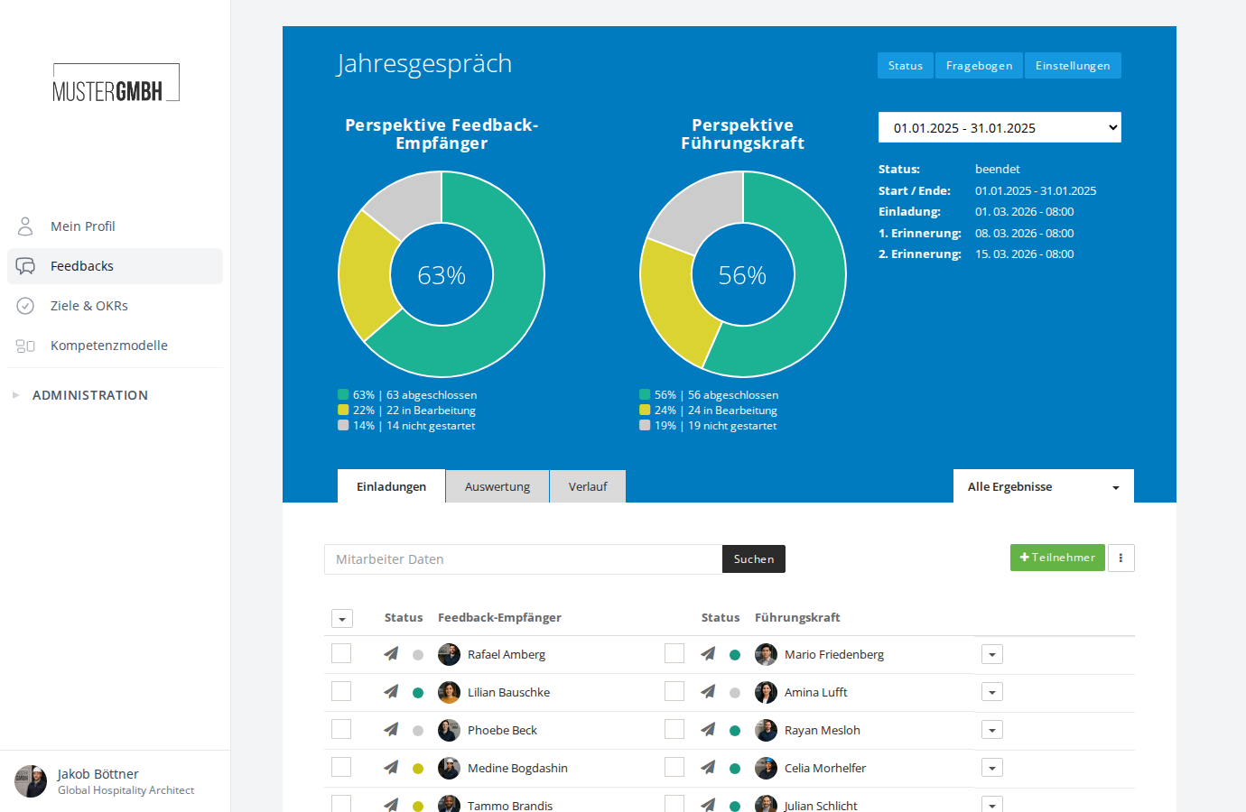
Below each chart, a legend spells out the exact numbers per status, for example “63% | 63 complete”.
Three or more perspectives: bar chart
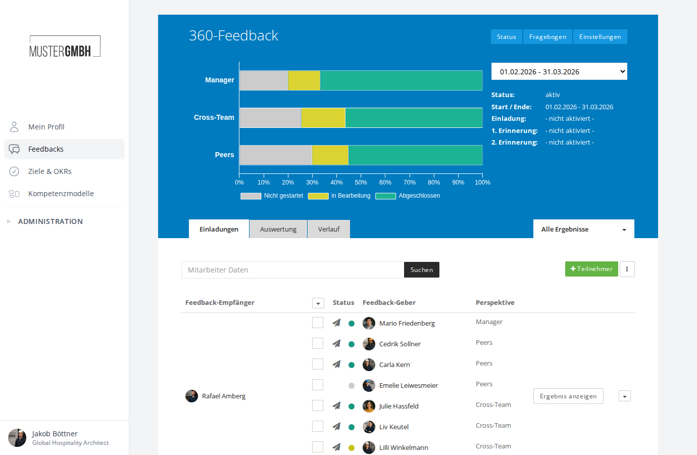
For processes with three or more perspectives (such as a 360° feedback), a horizontal bar chart replaces the donut charts. Each perspective gets its own bar.
Response rates in the feedbacks overview
You also find small donut charts in the feedbacks overview. For every active feedback process, they show the progress of the most recently active edition, broken down by perspective.
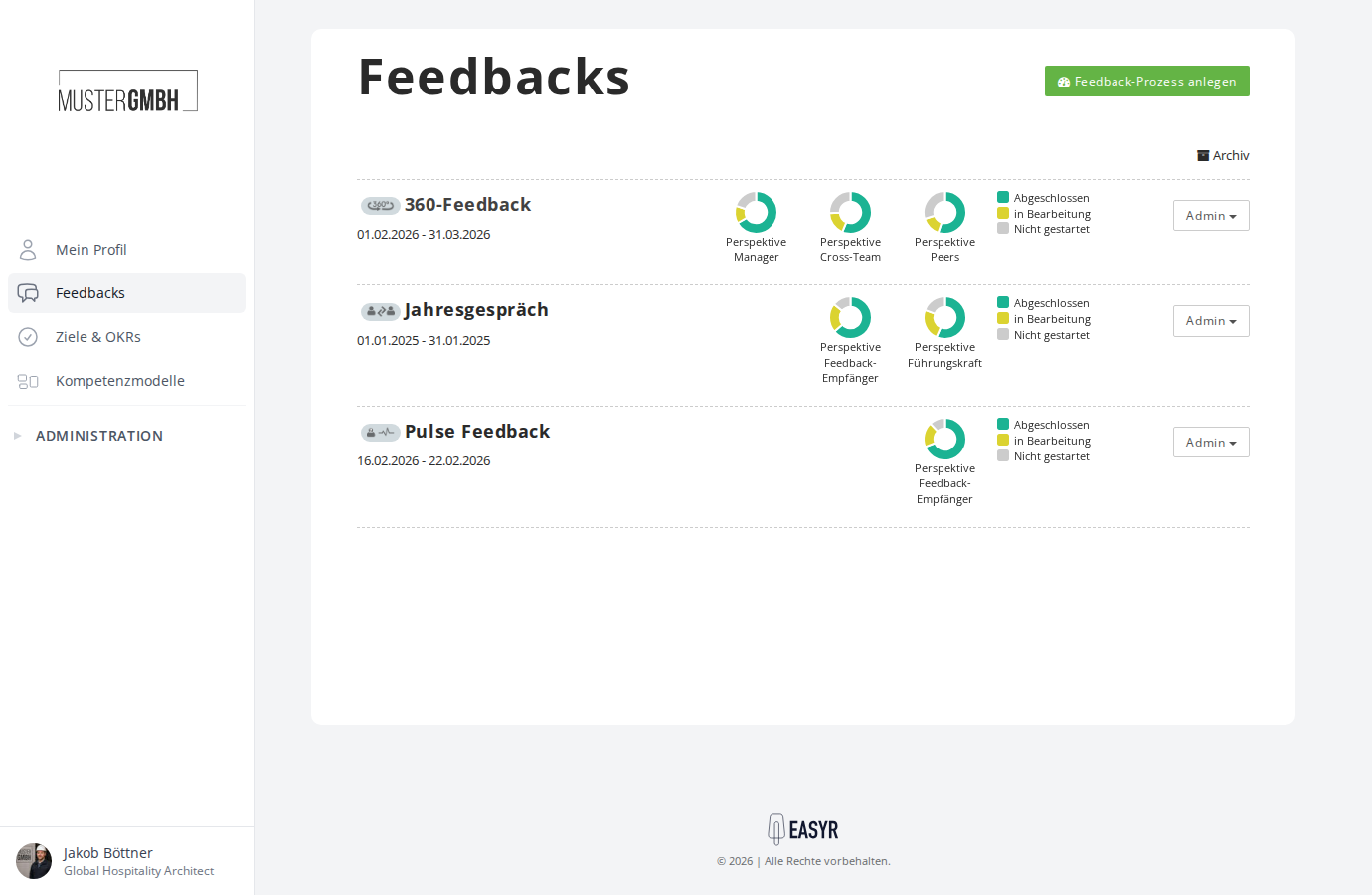
This gives you an at-a-glance view of how every running survey is progressing.
Color coding
A participation in a feedback process moves through three states:
- Not started (gray)
- In progress (yellow)
- Finalized (green)
The same colors appear in the charts and, in the participant list, as a colored dot next to each participant.
What each state means
Not started
The participant has not opened the feedback yet. They have neither clicked the link in their invitation email nor opened the feedback from their employee profile.
In progress
The participant has opened the feedback at least once but has not finalized it.
Finalized
The participant has completed and finalized the feedback. Finalized participations can no longer be changed.